Tuesday, March 18, 2014

Final Presentation


Hi Jimmy!

You're all finished, and ready to melt the polar Ice Caps.

Except for your hands, which wouldn't transfer over from the Maya file.


All from your Fancy Antarctic Hobo House! 


Seriously, Jimmy was a fun character to make-- further animations of Jimmy will be made in 2d, and I've even made a voice for him-- a cross between Porky Pig, Sylvester Stallone and Bubbles, from the HBO series "The Wire."

If you ask me REAL nicely, I might do his voice for you.

Thursday, February 20, 2014

Mudbox: Episode 1

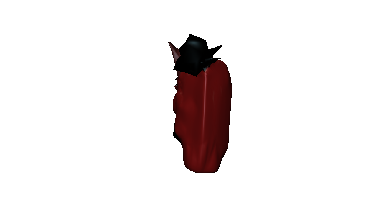
Meet Jimmy Divelle!


My first creation in Mudbox.

Jimmy was originally supposed to be a carefully crafted recreation of an old fashioned arcade machine. When the initial effort turned into what at first appeared to be a hopeless, rectangular mess, a friend came to my aid-- "I think he wants to be something else." they told me. I took their words to heart, and made a face and horns...but something was missing-- he needed a hat! "It's gotta be a fez..." I thought. Once again, the initial effort failed, so then I tried for a top hat. The general shape came out, a little spiky, but I think the vagabond devil would be proud. I then thought "why not throw in just a little more irony?"-- I threw him in an arctic wasteland to make him nice and comfy.

Now here he his at different angles!


Now here he is saying goodbye...

...I didn't animate it so you'll have to imagine it.

Thursday, February 13, 2014

De Architectura (3)

Final Result


Decided to go with a bit more of a basic design. You might notice some of these might look more vibrant than others-- it's just your imagination...and different specs in photoshop.

After a second rendering with an alpha channel, here's the composite:


Monday, January 27, 2014

Project 2: De Architectura (2)

Progress


Inspired by shows such as stargate, the St. Louis Monument, and other pieces of futuristic and medeival architecture, my creation reminds me moreso of a structure in the video game Starcraft. To keep things as basic as possible, no wave or extra block structures have been added as special perks. To convey only the basic message of my idea through this structure however, was an objective that has been accomplished so far.

Monday, January 20, 2014

Project 2: De Architectura (1)

For my structure, I will be creating an inter-continental warp zone as a portion of highway road.


 Here are a few of the many pictures I have looked at for influence:


http://www.dreamstime.com/stock-images-futuristic-architecture-illust-image5917584


http://commons.wikimedia.org/wiki/File:Porticoguardiagrele.jpg


http://stargate.wikia.com/wiki/Stargate?file=TheQueenSpacegate.jpg


http://news.stlpublicradio.org/post/stained-arch-just-dirty-not-dangerous-report-says

A few more popular influences such as the arch in St. Louis, Missouri, and the ever popular sci-fi icon Stargate, along with a few moreso unknown structures, such as the glass walkway, and the groin vault.

This should be an interesting experience in Maya, to begin A.S.A.P.


Tuesday, January 14, 2014

Project 1: Reflective Essay

A new chapter in the adventure of EMDA! For my first assignment, I have recreated images using scale in contrast and composition in images of architecture. This project was certainly something else, and I feel that this should be explained a little further.

My best final image would have to be my take on Daniel Portilla’s “Play Time.” I found this one to be the most interesting because while being very simplistic, like Peter Eisenmann’s Jewish Memorial shot, it’s subtle intricacies made up for anything as such. Some examples of this include how each office cubicle is cluttered with designs suggesting outward drawers, which could also potentially double as being boarding for the little houses for offices that the employees have. To the left we can see society on the outside of the office behaving completely normally, as if in some way we are all willing to accept each other, quirks and all.

In a way, I did not decide a scene was finished at all. The ones who decided the scene was finished were the artists who took the original pictures. My goal was to emulate the pictures I chose to be as exact as I could make them with the time that I was given. I stopped working when my scene matched the original image as closely as I could manage.

This is an entirely new experience for me. I had trouble even grasping what kind of pictures were desired for emulation at first, so I simply google searched “scale contrast and composition architecture” and skimmed through the result in google images. I chose the pictures very carefully, I wanted them to simultaneously be as simplistic as possible, but have subtle intricacies. Sometimes this was not as possible as at others, so at those points I simply picked out what looked cool.

This was an intimidating project for me. I am not even sure I did well, though I certainly hope so. While I am excited to be able to explore a new area of art, I feel like my usual motto of “The Tortoise Beats the Hare” might be challenged in the process. Though I am willing to tell myself “I don’t know” for the time being, as I always have the potential to be dead wrong.

Project 1: Recreated Scenes


Daniel Portilla, Play Time, 7.5.13


Rodovre Skyscraper, MVRDV and ADEPT, 11.18.09